Visualization
Configuration
Installing
Building the visualization plugin requires a few libraries/packages. The list of packages can be found in the Software chapter (part System Requirements).
You can install the visualization post processing tool by executing
the command make install_vis in the root directory of the project.
This will install the binary visualization executable in the install directory, vis/visualization.
Run configuration
Visualization is configured via a parameter in the run config file.
The existence of the tag run.outputs.<visualization/> is enough to enable the output of visualization data.
Using visualization
In order to use the tool, first install it by following the instructions
in the section above. Make sure that the visualization config run option
run.outputs.<visualization/> is enabled as well.
Run Stride as you would normally do. After the simulator has ran its course,
it has generated the necessary cluster data to CSV files in the output directory.
You can now start the visualization tool by executing vis/visualization <OUTPUT_DIR>. The output directory is the directory relative from the install directory, for example output/default/vis_Belgium.
The tool will display the cluster data generated by the simulator.
Overview features
World map
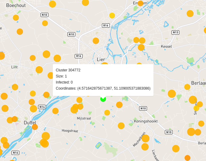
The first thing you see, when running the tool, is a world map. On this map you can see several circles, which represent the clusters saved by the simulator.
The color of the circles represents the percentage of infected people in the cluster. The following color values are used by default:
- Green: No people are infected in this cluster.
- Yellow: A low percentage of people are infected in this cluster.
- Red: A high percentage of people are infected in this cluster.
Hovering over a cluster displays some useful information, namely the cluster size, the infected count, the cluster ID and its coordinates.
Cluster panel
The cluster panel can be opened by clicking on a cluster. The cluster panels display a graph showing the evolution of infected persons in that specific cluster, over the simulation. It also displays general information of the cluster.
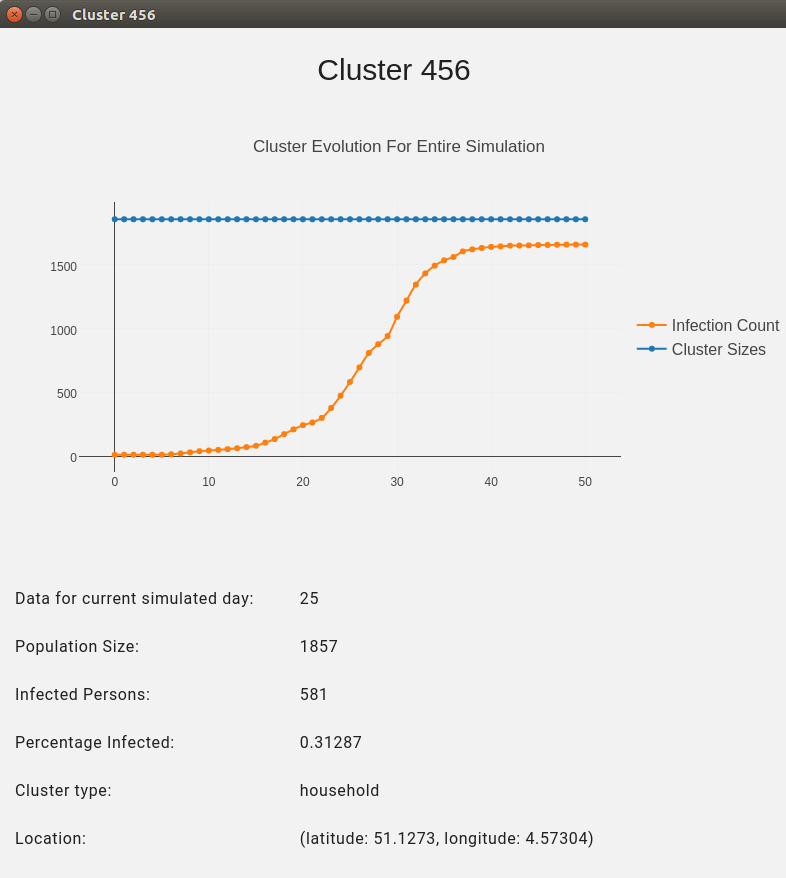
If multiple clusters are located on the same coordinates, multiple panels get opened with all the overlapping clusters.
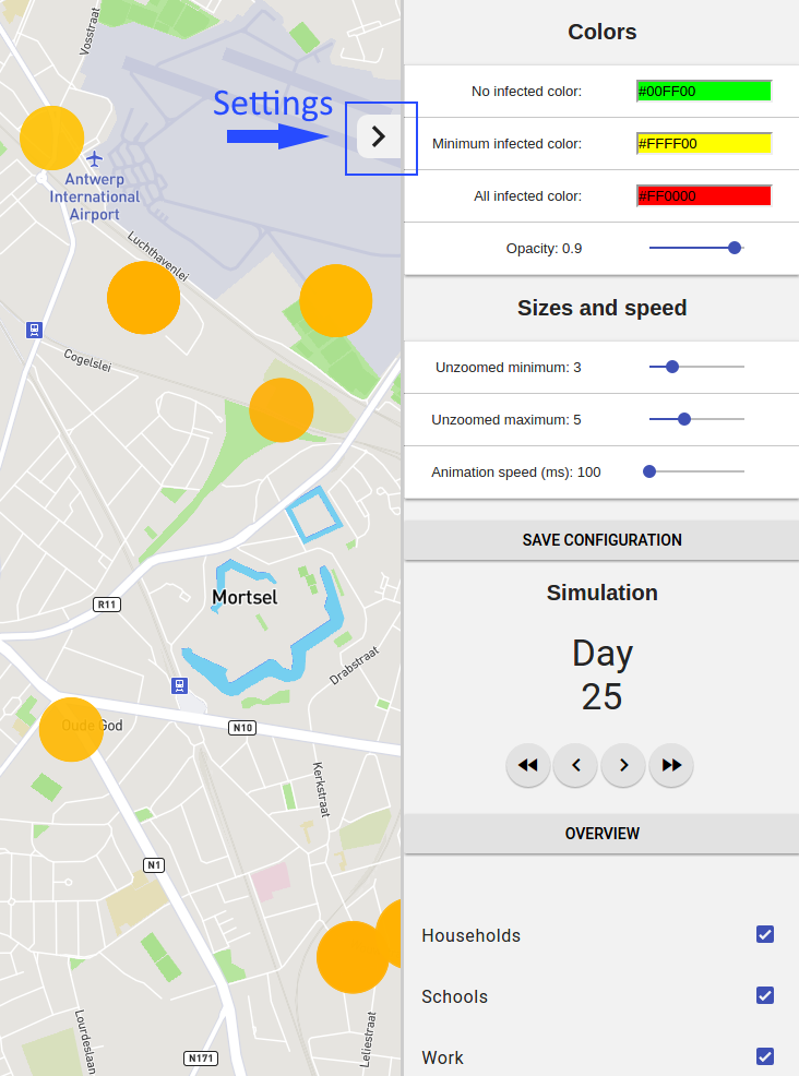
Sidebar
The sidebar can be accessed by clicking on the arrow icon in the top right. The sidebar contains configuration options for the tool and options to display/show different days of the simulation.
The configuration options include:
- The cluster display options such as colors and opacity.
- The sizes of the circles used to display the clusters and the zooming size.
- The animation speed when displaying the different days of the simulation.
- Display options in order to display certain cluster types.
You can save the configuration options after adjusting them, by clicking SAVE CONFIGURATION.
The saved options will be reused for further uses of the tool.
Airports
If airports are available in your simulation these can also be displayed. Airports show the amount of people that arrived in the last x days or on the previous day. Airports also show the area of influence. This is represented by a circle showing the boundary of the area. The area of influence may shrink or increase during the execution of a simulation.
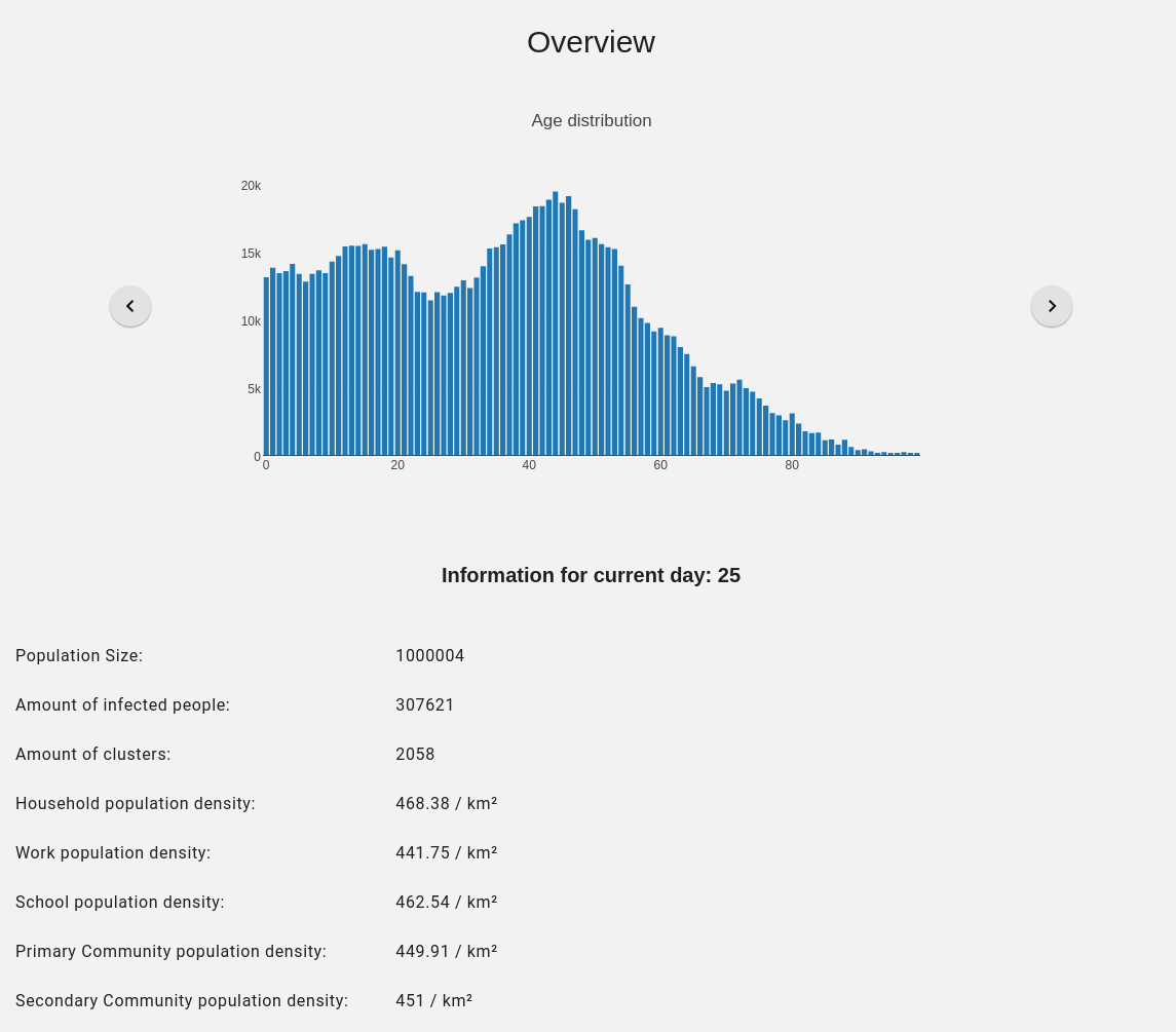
Overview
The overview can be opened in the sidebar. In the overview you can view specific cluster information, as well as view general information about the population. The general information includes graphs of the age distribution, graphs of the cluster sizes, population density, ...